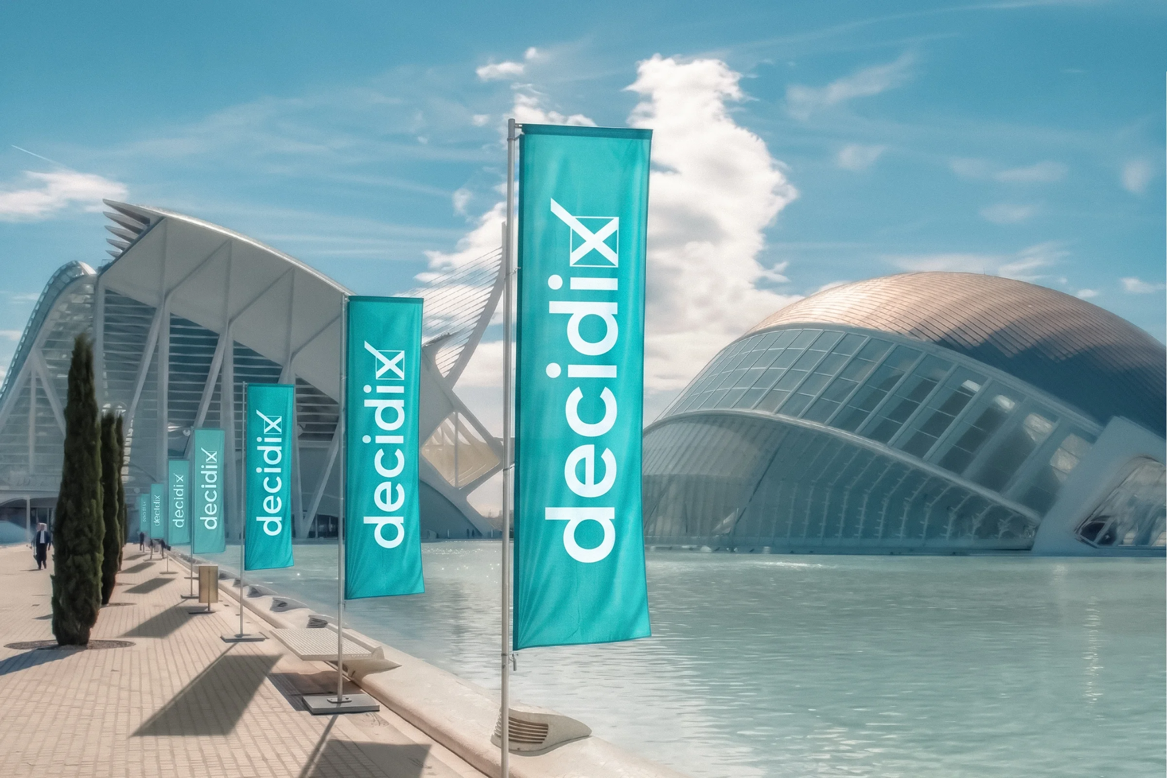
Decidix
Brand System for a Valencian Political Platform
A rebrand that kept what supporters already knew, the name and the ballot mark, and turned a patchwork of local logos into one system the client can extend town by town.
Materials are in Valencian and Spanish.- Outcome
- The new identity is live on decidix.org, from the site header and favicon to the campaign imagery.
- Client
- Decidix is a citizen-led political platform from the Valencian Community, active in towns and cities across the region. Its local groups stand under their own names, such as Avant Albal, Poble Catarroja or Sumant per Torrent, while belonging to the same movement.
- Task & Challenge
- Decidix came with one main logo and a collection of unrelated logos from its local groups. The brief was to bring them together under one updated identity without starting from scratch: the decidix wordmark and its ballot mark had to stay recognisable, just cleaner and more contemporary. The main logo also had to work as a system. Every town already in the platform needed its own version, and the client needed to be able to add new towns on their own as the movement grew. Some local groups wanted to keep elements of their original logos, such as the tower in Sumant per Torrent and the circled O in Poble, so the system had to make room for them. Finally, the client wanted a colour that would set Decidix apart from the major parties and make it recognisable at a glance. He came with turquoise as the starting idea, and I developed the exact shade during the project.
- Solution
- I presented several directions. One of them replaced the x in the name with the ballot mark itself. The client first asked to keep a regular x with the mark placed next to it, but once he saw both side by side, the integrated version won, and the mark went back into the word. The final x now reads as both a cross and a tick: the act of deciding, built into the name. Turquoise leads the palette, supported by complementary dark teal, light blues and a warm cream, with a few small accents, including an orange for calls to action, so the brand has range without turning entirely turquoise. Typography is Parkinsans, a free Google Font, so local teams can use it without licensing costs. Each local name pairs with the wordmark in horizontal, stacked and badge versions, with fixed proportions and spacing. Everything is documented in a 15-page brand manual covering construction, clear space, the brand architecture, colour values and incorrect uses.
- Role
- I designed the logo and the brand architecture for the local groups, built so the client could extend it without a designer. The brand manual was my own initiative: it wasn’t in the brief, but I felt a system meant to be extended needed clear rules. A few months later the client came back for a second project: social media templates and a bi-fold leaflet in Spanish and Valencian, both editable. I built them in Canva so the team could update them on their own.
01Collecting every logo — I gathered all the existing local logos to compare their scale and formats. Some town names were very short; others were so long they ran to two lines. The task was to find one format that kept the short ones from looking lost and the long ones from shrinking or stretching.
02Starting from the longest name — I built the proportions around the longest town name, which set the relationship between the main wordmark and the local name.
03Making the towns equal — I first set the town names smaller than the wordmark. The client asked for them to match its size, so local groups would feel like equal partners rather than footnotes, and the system was rebuilt around that.
04Testing with one town, then all of them — each logo direction was shown paired with a real town. Once the client chose one, I adapted it for every local group.
05Writing the manual — after all the versions were approved, I put the rules into a brand manual so the system could grow without me.