Piana Technology
Sustainability Report
Piana Technology is a family-run Italian manufacturer with roots going back to 1582, now focused on sustainable, non-toxic alternatives to conventional foams and fibers. Its patented materials are fully recoverable, and the company positions itself as a driver of the shift toward a circular economy across the industries it supplies.
The brief was Piana’s 2023 Sustainability Report — a document meant to carry real ESG substance (emission reductions, water savings, responsible sourcing) without reading like a compliance filing. The added constraint was continuity: Piana had commissioned a set of custom illustrations for the previous year’s report and wanted to keep using them, so the new report had to sit visually close to the one before it rather than start from a blank page. For the client, staying recognizable mattered as much as improving on it did.
I designed the full report — cover concept, page architecture, typography, and the data visualization system — working within the visual constraints the client had already set.
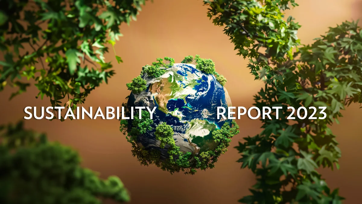
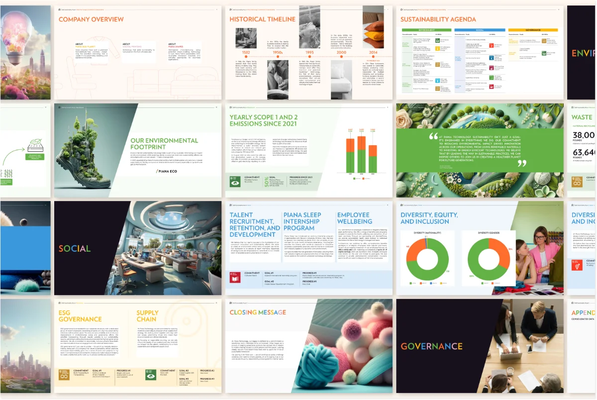
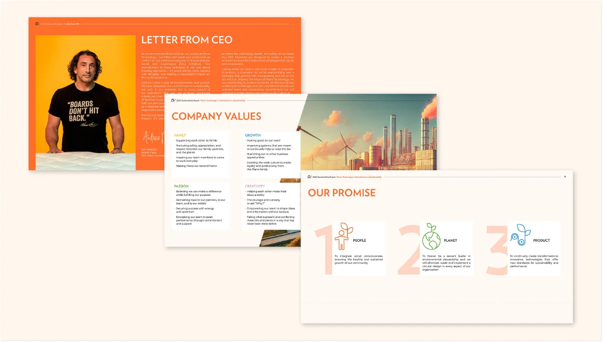
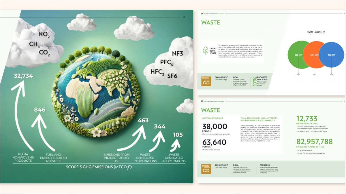
Because the existing illustrations had to stay, color became the main lever for making the report feel structured and current. Piana’s brand already carried several bright accent colors, so each section of the report was given its own color from that set — a lightweight system that lets a reader tell, at a glance, which part of the report they’re in. Data itself was translated into simple, comparable visual units instead of tables, and a repeating multi-column layout — used across spreads like the Company Overview section — lets dense ESG figures sit next to plain-language explanation. The cover went through the most iteration of any single element: after the client’s own generated image proved too rough to carry it, I proposed a set of alternatives, and we landed on one built around an embossed, textile-inspired treatment over a global motif — a quiet nod to the company’s origins in textile manufacturing.
01Studying the existing report — reviewed the previous year’s report first to understand Piana’s visual language: their signature fonts, their color palette, the overall tone.
02Reading for structure — went through the report text itself to identify which information could actually be visualized, and sketched out how the content could be broken into blocks and laid out across spreads.
03Testing the idea — built a single trial spread to show the client the direction and get approval before designing the rest.
04Finding the color system — noticed the brand already used several bright accent colors, and proposed giving each section its own color, so every section reads as its own identity within the larger report.
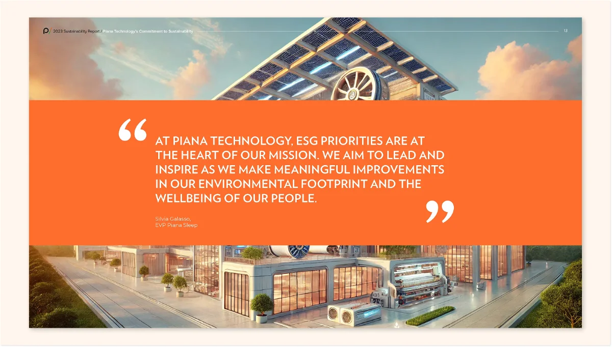
05Revisiting the images — started with strong stock photography, then switched to the client’s own generated images from the previous report after a mid-project request to bring them back.
06Settling the cover — the cover took the longest to land. The client wanted to use one of their own generated images, but its quality and execution weren’t strong enough to carry a cover. I proposed a set of generated alternatives of my own, and we settled on one of those together. The project went through roughly five rounds of revisions in total.