ETUC
Negotiating the Content of Standards
An EU handbook laid out with a handwritten accent type and sketch-style visuals, so it reads less like policy and more like a field guide.
- Outcome
- The agency that brought me in for this handbook has since come back to me for another project.
- Client
- ETUC, the European Trade Union Confederation, represents 45 million workers across Europe, working to keep European technical standards aligned with labour rights and workplace safety. This handbook, published with support from the European Union, explains how unions can take part in negotiating the content of those standards.
- Task & Challenge
- The source material was exactly the kind of content that usually ends up as a wall of text: procedural, legal, written for people already inside the system rather than for the union representatives who would actually need to act on it. The goal was to strip that register out entirely and make a document people would genuinely want to open and use, not just file away for reference.
- Solution
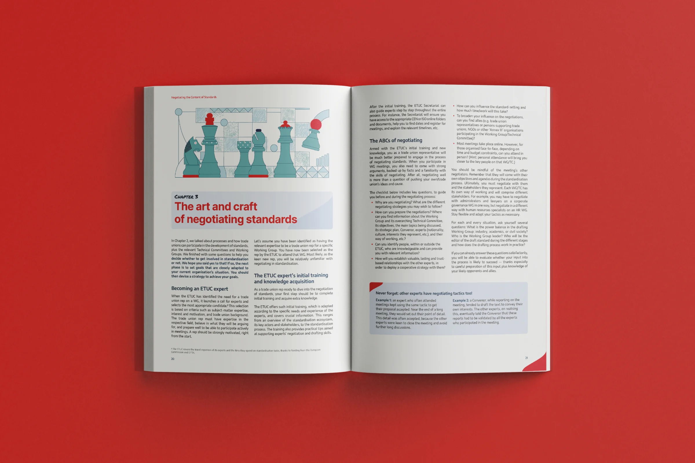
- The word “Handbook” set the direction: something you’d carry around, scribble in, and actually use, rather than a polished institutional publication. Handwritten type and loose, slightly imperfect line illustrations run through the cover and interior spreads, giving the document a personal, approachable feel, while the red-and-white palette and EU branding keep it clearly tied to its institutional source. A recurring line, “Unions can influence standards too”, is treated as a graphic statement in its own right rather than buried in body copy, giving the handbook a clear point of view instead of just information.
- Role
- I led the art direction and laid out the full handbook (structure, typography, and the visual style), working from ETUC’s source material on standard-setting and union representation. The illustrations started from stock and I reworked them into one consistent style.
01Starting from the brief — received clear guidelines from the client: exact book dimensions, margin sizes, the organisation’s brand book, and their past published documents.
02Diagnosing what came before — reviewing those past documents, I noticed weak contrast and a layout that felt dated, and decided to aim for something lighter, simpler, and more minimal by comparison.
03Finding the concept — the word “Handbook” became the starting point, together with a handwritten-style font already included in the client’s branding. I decided to use that font not as the main typeface but for quotes, callouts, and the word “Handbook” itself. Once that was in, it followed naturally that the rest of the book could carry hand-drawn elements too, like arrows and illustrations.
04Structuring the text first — before touching illustration, I worked through the text itself: how many columns, what could become a callout, what could become a table, how the whole thing should break into a layout.
05Adding illustration last — illustrations came only after the text and tables were laid out. Adding them was my own proposal, to break up the handbook so it carried something visual and specific to each chapter’s content, not just running text. A large illustration opens every chapter, referencing what that chapter covers; smaller ones fill leftover space where it made sense. I sourced similar hand-drawn styles from stock and reworked and finished them myself to match.
06Testing and approval — built a cover concept and two or three test spreads first and sent them for feedback. The notes that came back adjusted a few spacing and graphic details; I also shared one illustration as a sample of the direction. Once that was approved, I carried the same approach through the rest of the book.