i-Legal
Services Presentation
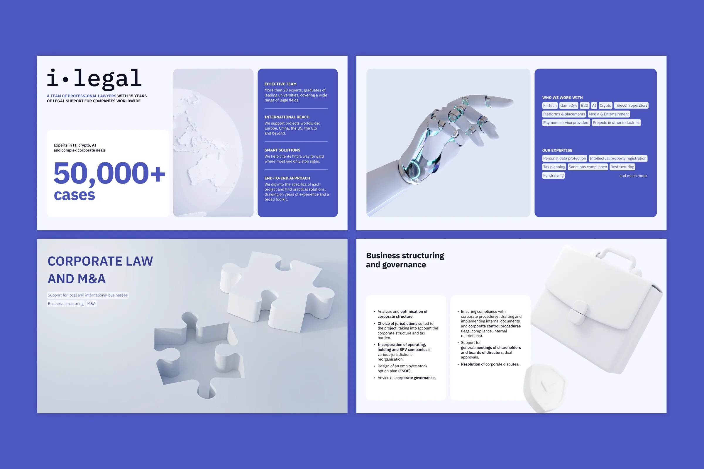
A services deck for a tech law firm: a lighter take on the brand blue, white 3D objects, and slides built to scan.
The original deck is in Russian; the cover slides have been translated into English for this portfolio.- Client
- i-Legal is a law firm built around the IT industry. For more than 15 years, a team of over 20 lawyers has supported tech companies in Russia and abroad across FinTech, AI, crypto, intellectual property, data protection, M&A and tax, from early-stage startups to established industry players.
- Task & Challenge
- The firm needed a new services presentation to introduce its practice to clients. I started from their previous services presentation and their brand book: a dark navy and grey palette with a slightly pixelated, digital style. The brief was to keep the official blue and stay close to the existing identity, while making the deck feel fresher and more contemporary. The presentation also had to show the firm’s technological side, including its work with AI. The difficulty was that the official navy didn’t hold up in a modern deck. It looked heavy and dated, and it worked against the very idea the presentation needed to communicate.
- Solution
- Instead of using the navy as it was, I proposed a brighter, lighter shade of the same blue. It stays recognisably i-Legal, but it reads as clean and technological rather than heavy. This shift set the tone for the whole deck: a light, minimal layout with one saturated blue for accents, information panels and the closing slide of client logos. The deck runs on two kinds of slides. Section openers introduce each practice area with a large title, topic tags and a single white 3D object that stands for it: a lock for digital law, a puzzle for M&A, a safe for private wealth. Content slides break each practice into a grid of service cards with line icons and key phrases in bold, so readers can scan a page quickly and stop where something applies to them. Half of the text was new, and half was adapted from the previous services presentation.
- Role
- I led the art direction and designed the full presentation: moodboards, visual concepts, colour, slide structure, imagery and every layout.
01Studying the brand — reviewed the client’s brand book and previous services presentation to understand what had to stay and what could change.
02Moodboards and concepts — put together four moodboards and developed three directions, each with a short description and sample slides: a light minimal version with photography and soft blue tones, a light version with a green accent and a clearer content structure, and a blue version built around abstract 3D shapes with a strong tech feel.
03Combining the strongest parts — the final direction took the 3D visual language of the third concept and the slide structure of the second, set in the lighter blue that grew out of my proposal to brighten the brand’s navy.
04Building the imagery — the 3D objects came from stock libraries, and I reworked each one to match the palette and style. The cover was partly AI-generated and then refined in Photoshop.
05Iterating on the cover — the project went through many rounds of revisions, and most of them focused on the cover. It changed completely between the concept stage and the final version.