SimpliFlying
Sustainable Aviation Outlook Infographic
SimpliFlying is a globally recognized aviation strategy consulting firm that helps major airlines and airports navigate the future of air travel, with a particular focus on innovation, marketing, and crisis communications. The firm is considered a thought leader in the industry, and its reports are read closely by the airlines and airports it covers.
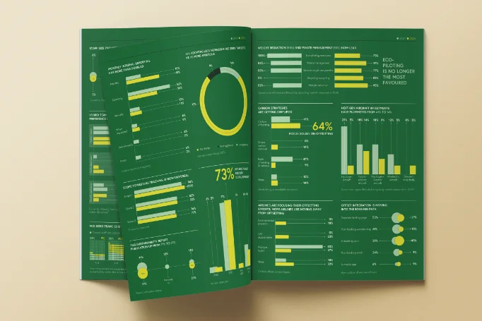
The brief was the firm’s Sustainable Aviation Outlook Report, built on genuinely dense research: regional SAF (sustainable aviation fuel) adoption, year-over-year usage growth across major carriers, stakeholder sentiment on sustainability, and the pace of change across the industry. Handed the finished research, the task was to give each piece of it a visual form specific enough to carry its own insight, rather than defaulting to one generic chart style repeated seven times.
Working from the provided research, I was responsible for architecting a cohesive visual narrative across seven distinct infographic layouts — choosing chart type case by case and keeping them visually unified as a set.
Each spread is built around the shape of its own data rather than a single template stretched across all seven: a world map compares regional SAF usage side by side, circle-scaled charts track the industry’s total SAF use growing year over year, and bar charts show how differently stakeholder groups — board members, suppliers, communities, government — rate sustainability as a priority. Elsewhere, line charts follow individual airlines’ SAF adoption over time, and a simple before-and-after comparison shows climate-focused partnerships growing from 35% to 45% of the client base. A green-driven palette and a consistent typographic system hold the seven layouts together as one report rather than seven disconnected charts.
01Receiving the data — got all the research for all seven infographics at once, arriving as a mix of tables and already-built charts. The existing charts were mostly line or pie graphs, and all of them looked essentially the same.
02Proposing a direction — sent the client a moodboard of reference dashboards showing a wider range of chart styles, to establish that the report could look more varied than the source material suggested. Once that moodboard was approved, I moved into the actual layouts.
03Blocking each page — each A4 page needed several specific charts. I worked out how many would fit, blocked out rough rectangles for size and placement, and then designed each chart to fit its allotted space.
04Varying the visual language — with four or five charts often sharing a single page, I deliberately pushed for variety chart by chart, trying different ways of representing similar data so a page never read as five near-identical graphics repeated in a row.