EAL EuroAsia Logistic
Brand Identity for a Logistics Company
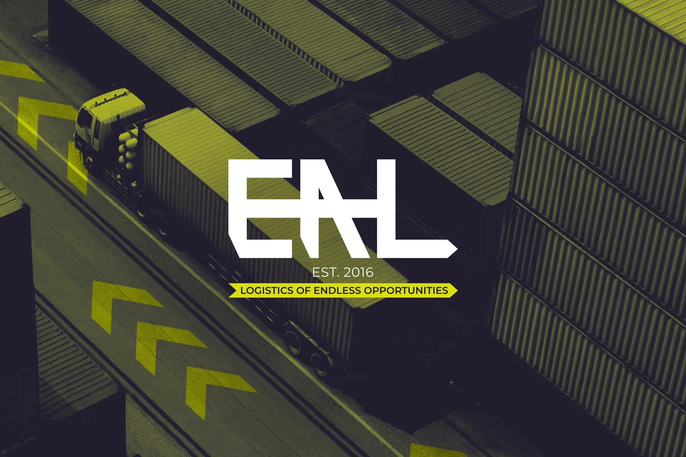
A rebrand built on a diagonal cut, a visual shorthand for the speed and direction of the cargo it moves.
- Outcome
- The new logo, lime colour system and slogan are now in use on the company’s website.
- Client
- EAL is an international freight forwarding company connecting Europe and Asia, specialising in express delivery of consolidated cargo from Southeast Asia, Turkey, and Europe.
- Task & Challenge
- The company came in for a full rebrand built around a tagline already in use on their marketing materials (“Logistics of endless opportunities”), but with no visual system behind it yet. The brief was to give that phrase an identity that felt as dynamic as the routes the company actually runs, not just a cleaner logo bolted onto the old messaging.
- Solution
- Since EAL moves cargo across continents on a constant basis, the identity needed to read as movement rather than stability. The wordmark is built on a diagonal cut, a visual shorthand for direction and speed, and that same diagonal repeats as a chevron pattern across two colourways: lime-green arrows on dark green, and dark navy arrows on cream. Unbounded carries the display type, Montserrat handles body text, and the palette stays to three colours (dark green, lime, and navy), so the system stays recognisable at any scale, from a shipping container down to a business card. For the company’s trade-show appearance under the new identity, I designed the stand graphics, two wall panels and a counter, bilingual in English and Russian, each carrying the chevron pattern, a QR code linking to the company site, and a clear service list (cargo delivery from China, marketplace factoring, procurement, customs brokerage) so visitors could read the booth and understand what EAL does within seconds.
- Role
- I led the rebrand end to end: logo, colour and pattern system, typography, and the exhibition materials used to introduce the new identity at trade events.
01Sketching the wordmark by hand — the diagonal cut wasn’t planned from the start; it emerged while hand-sketching different ways to combine and interlock the company’s letters, testing how they could sit together as one mark.
02Building outward from the cut — once the diagonal appeared, the arrow and the rest of the graphic system followed from it rather than being designed separately. In total, five or six logo variants were developed before settling on the final version.
03Choosing the palette — competitor research showed most players in the category leaning on red-toned palettes, and EAL’s own previous branding had been blue and orange. The client wanted something that read as genuinely new rather than a refresh of the old identity, which led to the green and dark navy palette used in the final system.