zenheat
Brand Identity
Zenheat sells its own line of small home appliances — coffee machines, kettles, and kitchen tools — through Russia’s major online marketplaces.
This was a brand built from zero for market entry: no existing reputation, and no room to earn one gradually. On a marketplace, a product lives or dies by how it reads as a thumbnail-sized photo next to dozens of competitors. The identity needed to read as clean and contemporary rather than blend into generic marketplace packaging, with a mark simple enough to hold up at app-icon scale and at delivery-van scale alike.
I led the identity from concept to delivery as an independent project — logo, color system, typography, and packaging.
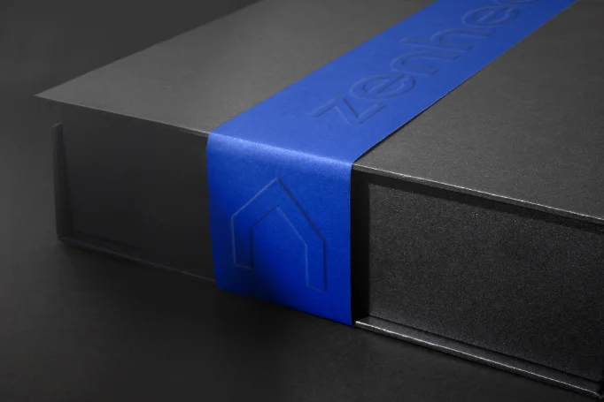
The system stays deliberately minimal: a clean wordmark paired with a reduced house-shaped mark, standing for the comfort the products bring into a home. Color gradients — in blue-violet and orange-gold variants — are used as a controlled accent rather than the whole identity, following a moodboard built around smooth lines and semi-transparent gradient textures common in tech and lifestyle branding. Typography pairs Exo 2 for headlines with Roboto for body text, keeping the system legible at small sizes. The same mark and gradient system carries through packaging — including an embossed treatment on the box itself — marketplace listings, delivery van livery, and product photography shot in warm, lifestyle-driven settings rather than as flat product shots, so the brand reads consistently everywhere it shows up.
01Starting from almost nothing — the brief was just the company name and what it sells; tone, style, and direction all had to be defined from scratch.
02Researching the category — analyzed competitors on the marketplaces Zenheat would sell through, then built several moodboards from that research and presented them to the client, who selected one direction to move forward with.
03Designing the wordmark — the one firm constraint from the client was letterform-only: no monograms, no pictorial marks. I tested several typefaces that fit the direction, proposed a few logo variants, and refined the one the client chose.
04Finding the symbol — a standalone mark was needed for favicons and social avatars, where the full wordmark would read too small. Several ideas were tried and rejected, including versions built around a single letter, before the house shape emerged — a natural fit, since Zenheat sells appliances and tools for the home.
05Choosing the gradient — the gradient treatment came from visual references I liked during moodboarding rather than one deliberate rationale; it fit the tone the client had already chosen and was carried through as the identity’s controlled accent.